Role
Soloproblem · product · build · deploy
Personal product · 2025–26
A training app built for a sample size of one
A workout tracker I designed and built for exactly one user: me, one that makes the progression decision for me and refuses to let me skip the things that keep my back intact.
Role
Soloproblem · product · build · deploy
Type
Personalprogressive web app
Stack
HTML·JSNotion API · offline-first PWA
Year
2025–26shipped & in daily use
GRIND is a workout tracker I built for exactly one user. I came back to training with a lower-back issue and a home gym instead of a commercial one, and couldn't find an app that respected either constraint.
So I built one. The interesting part isn't the app. It's what designing for a sample size of one let me get right that mass-market trackers get wrong, and the judgment it took to leave almost everything out.
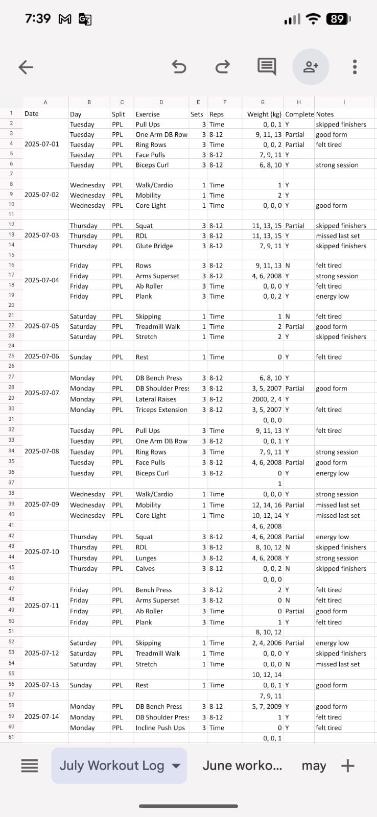
For years I tracked every session by hand, plan the workout on my computer, build a phone-friendly version of the sheet, take it to the gym to fill in set by set. New month, new sheet.
It worked the way any duct-taped system works: just barely, and only because you're the one holding it together. But the important part was invisible at the time. Every session began the same way, open last month's sheet, find what I lifted last time, and make a judgment call about today. 3×8 at this weight, moved well, push it. That manual loop, look back, then decide, was the real product. I just hadn't noticed it yet.
And, plainly: I didn't want to pay a monthly subscription for something I'd been doing free in a spreadsheet for years. Paying rent on my own training data was never going to sit right, a thread that shows up again in why Notion ended up as the backend.
The space is saturated, Hevy, Strong, Fitbod, a dozen others. They're well-built, and none of them fit, for a reason that's structural rather than cosmetic.
Eight-hundred-exercise libraries, every training split, social feeds, a population of millions to serve. To work for everyone, they have to assume nothing about you. I needed the opposite: depth for one body, one equipment set, one injury history. And the two defaults breadth forces are exactly backwards for someone managing a back,
Something you tap past on the way to the "real" workout. For me it's the workout's insurance policy.
You log your sets and decide for yourself. That's precisely the negotiation I lose when I'm tired.
The problem was never that no tracker exists. It's that every tracker optimizes for the wrong axis.
Design for n = 1, ruthlessly. It removed roughly 80% of the product surface before I'd drawn a screen.
Every decision optimized for adherence and safety for one person, with zero obligation to generalize to anyone else. That single constraint did most of the design work, no onboarding for unknown users, no settings for preferences I don't have, no library of movements I'll never do. What remained was sharp enough to actually decide.
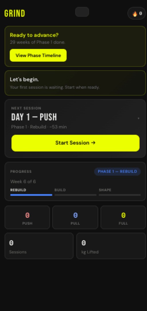
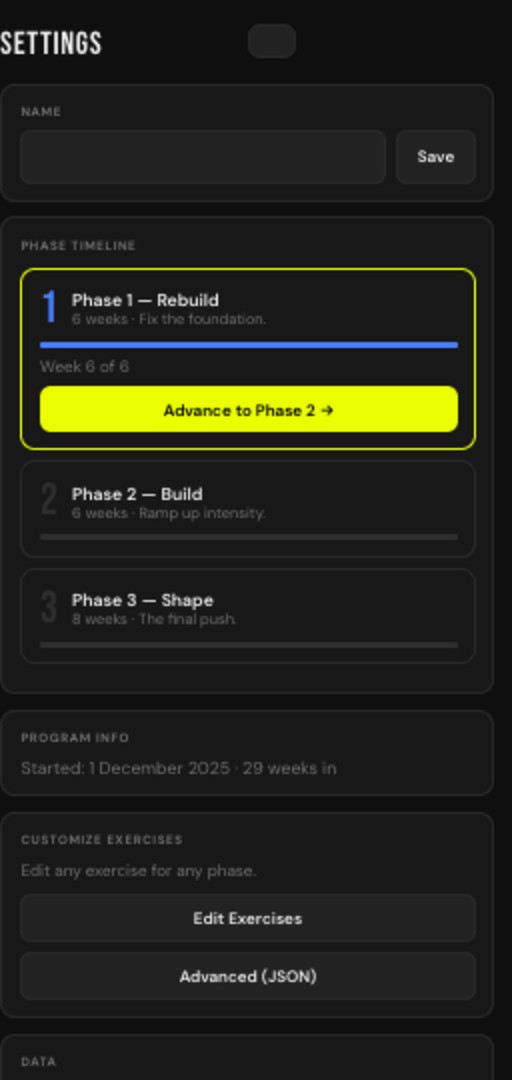
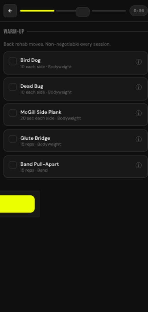
The program is three phases, Rebuild → Build → Shape, and the app knows which one I'm in. "Progress" means something different in each. Most trackers are a flat logbook with the phase kept in your head; here it's structural, so the app changes its own behavior as I move through the program.
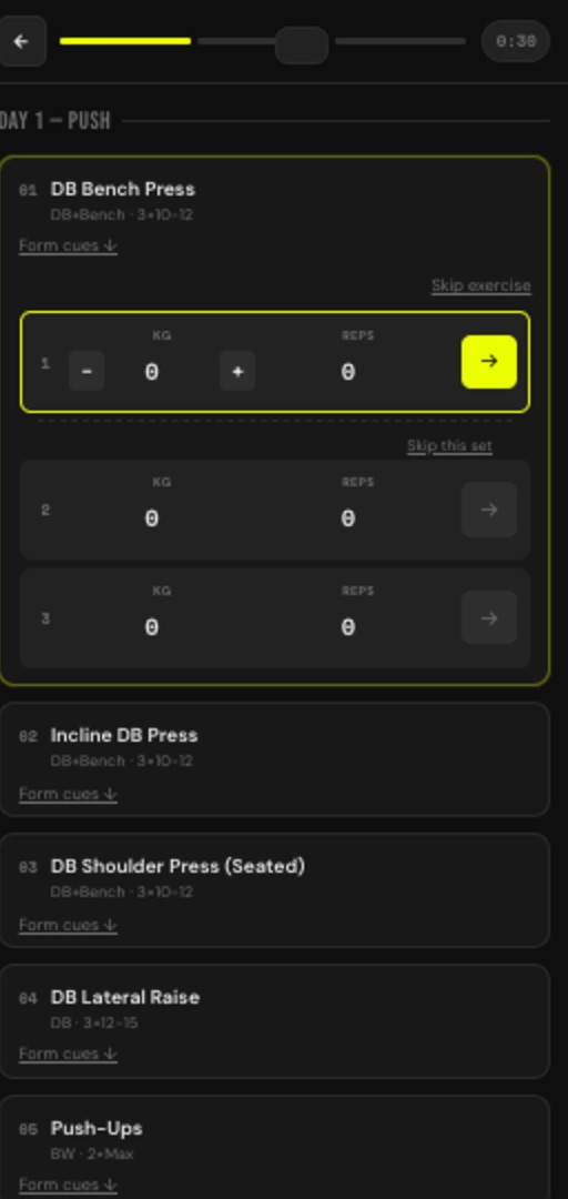
This is the Excel loop, automated, the feature I'd defend hardest. GRIND reads the last session and proposes the next set, load, or rep target itself. When the decision is already made, the version of me that's tired and bargaining at 6am never gets a vote.
McGill "big three" scaffolding is front-loaded and non-dismissible. A button that can be skipped will be skipped on exactly the day the back is most vulnerable. So the interaction simply doesn't offer the option. The constraint is the feature.
A deliberate non-obvious choice. I already live in Notion, so it gave me an editing surface for free, full ownership of my data, and no lock-in to a product I built solo. The tradeoff, wrangling sync through a CORS proxy, was worth keeping the data somewhere I control.
Signal drops mid-set under a building, between racks, in a basement. An app that fails at the rack is worse than a notebook. The PWA, local-first architecture means the tool never blocks on a network it can't rely on; sync catches up when it can.
Every one of these was a feature I could have shipped in a weekend. Leaving them out was the harder call, and the right one.
No feed, no followers, no sharing. Easy to add, and it would have made the product worse for its one user.
Tempting and on-trend, a distraction from a progression model I can actually trust and reason about.
I do maybe fifteen movements. A searchable database of 800 is overhead, not value.
Adherence comes from the gate and the pre-made decision, not a dopamine mechanic that punishes a rest day.
The discipline of a product built for one is that there's no growth metric quietly arguing for scope creep.
GRIND shipped, and it's the tracker I actually open. For a one-person product the only metric that means anything is did the person keep using it, and the answer is yes.
What I'd change: the Notion sync via a CORS proxy is a fragile seam I'd replace with a proper lightweight backend if this were ever more than a tool for me. And the phase transitions are still manual, the next version should detect when I've earned the move from Rebuild to Build rather than waiting for me to flip it.
A sample size of one is a real limitation, and I'd never put this in front of a market. I'm including it anyway, because of what it shows about how I work when there's no one to perform for: find the actual constraint, scope to it without flinching, build the smallest thing that fully solves the problem, and have the discipline to stop. The same instinct that says don't add the social feed is the one that protects a real product from death by feature.